WHEN YOU READ A COMIC, DO YOU LOOK AT THE PICTURES OR WORDS FIRST?
I love asking this question to everyone I meet. For the longest time I was under the assumption that everyone viewed comics the same way I did growing up: reading the words first, followed by the pictures. Sure, good art was important to me, but words were the thing about a comic. Sometimes I’d go entire issues or trades barely looking at the images, letting the dialogue and narration of a story carry me through.
Vince, on the other hand, grew up experiencing comics in the inverse; he would scan the image before the words. I didn’t know that until it was brought up in conversation one day while working on Skies of Fire. Before then, it never occurred to me that people would have different ways of experiencing the medium.
Vince, on the other hand, grew up experiencing comics in the inverse; he would scan the image before the words. I didn’t know that until it was brought up in conversation one day while working on Skies of Fire. Before then, it never occurred to me that people would have different ways of experiencing the medium.

So is one way inherently better than the other? I think if you ask most people they would say of course not! But then how about this question: does the way you experience comics affect your taste in them? And the followup: How?
A good example I like to use is Geoff Darrow’s Shaolin Cowboy, a comic we at Mythopoeia adore. It’s tremendously detailed yet almost bereft of words. Instead, the comic focuses on beat by beat action storytelling that rivals any great Kung Fu flick.
A good example I like to use is Geoff Darrow’s Shaolin Cowboy, a comic we at Mythopoeia adore. It’s tremendously detailed yet almost bereft of words. Instead, the comic focuses on beat by beat action storytelling that rivals any great Kung Fu flick.

On the back of the hardcover of Shaolin Cowboy is the following quote by The Comic Pusher: “This feels like simple, hollow artistic masturbation in four colors, stapled with a barcode for the suckers to lose three fifty on.”
(The Comic Pusher actually has really awesome and thoughtful content. Wish he would still update!)
It’s displayed proudly next to unrelenting praise by comic luminaries Mike Mignola, Stan Sakai, and a slew of others. Did the reviewer from The Comic Pusher simply not get it? Or is it that hes simply used to experiencing comics differently? That’s what I thought anyway when I read the quote.

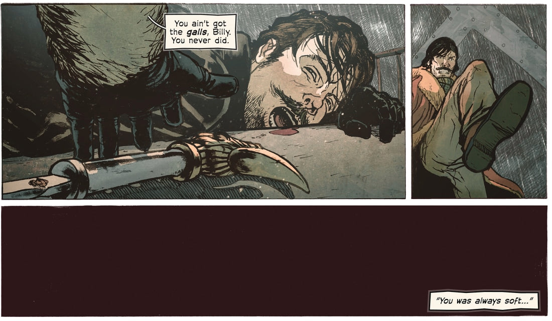
It’s funny because I think maybe ten years ago I would’ve agreed with him, but having started making my own comics I find myself aligning with that more visually-driven style. Both Glow and Skies of Fire are image-first books where we very consciously try to let the visuals do the heavy lifting.
Why do we do make comics like this? Well, a lot has to do with our training. Both Vince and I went to film school, where the first lesson they teach you is that a story should be able to be understood strictly through images. Our professors taught us that if we were to mute a movie, we should still more or less be able to figure out what’s going on. We’ve made no secret that our projects began life as screenplays or teleplays.
Why do we do make comics like this? Well, a lot has to do with our training. Both Vince and I went to film school, where the first lesson they teach you is that a story should be able to be understood strictly through images. Our professors taught us that if we were to mute a movie, we should still more or less be able to figure out what’s going on. We’ve made no secret that our projects began life as screenplays or teleplays.

Comics are not movies, as a lot of our critics like to point out :). And of course there are a lot of ways to combine pictures and words. One of the limitations in the way of creating comics like we do is that for the most part our wordplay tends to be limited towards spoken dialogue or sound effects. There’s a lot more interesting ways to push the interaction between words and pictures in interesting ways. Our friend Greg Needham’s Mixed Signals comes to mind:
Regardless, I’m not writing to defend or vilify any artist’s style. People are free to create and enjoy what they want, and it’s that rich tapestry of variety that makes comics -- and all art, for that matter -- beautiful. Pictures or words. Which one do you look at first? And have you ever tried it the other way around?


